

The Ultimate Guide To Typography (Infographic And Resources Included)
The ultimate guide on Typography and how it impacts designs and human emotions

🤳 I help Developers, Designers and Entrepreneurs to learn about productivity, mental health, marketing, web development and how to avoid burnout. 🚀💻 Im also an avid book reader 📚
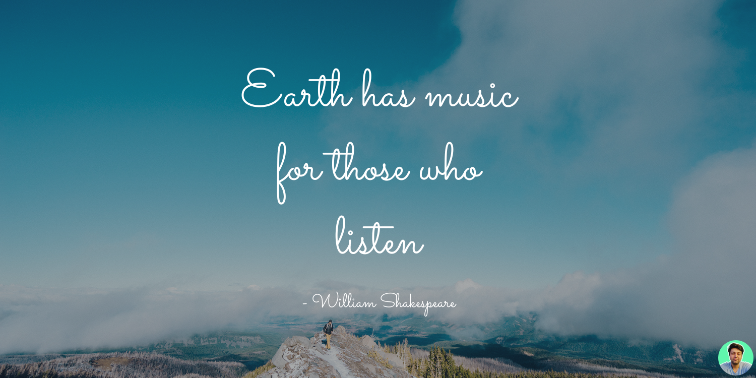
Typography is the craft of endowing human language with a durable visual form — Robert Bringhurst
Whether you’re are a designer, developer, product manager, entrepreneur or an editor of a newspaper, the art of typography will always be a part of your life. From choosing the right font to positioning it on the page, typography plays an important role in making your design look good.
But have you ever wondered why some fonts look good together while others don’t? Why do some fonts feel heavy and slow, while others are light and snappy? This article will explore the various things that go into making a good visuals and balanced designs. What this article is NOT about is how to choose fonts in your designs but this article should give you a enough insight on how to leverage right fonts with a Design system like Material Design!
Lets gooo! 🚀
History and Evolution of Typography
The ancient era was all about “saying it with pictures and visuals” and “Maths” (that’s fascinating, right?). It is Phoenicians who are credited with creating the very first alphabet and around 1000 B.C. — the same alphabet was used by the Greeks. In fact, the word Alphabet is a combination of the first two Greek letters, Alpha and Beta.
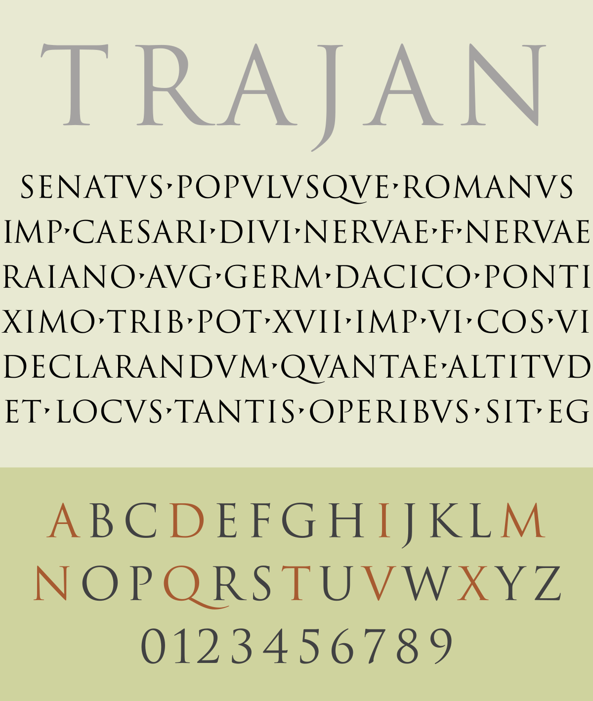
Fast forwarding to Middle Ages, Romans used a typeface called Trajan. It was used in all official documents hand written by Roman officials in 113 AD.
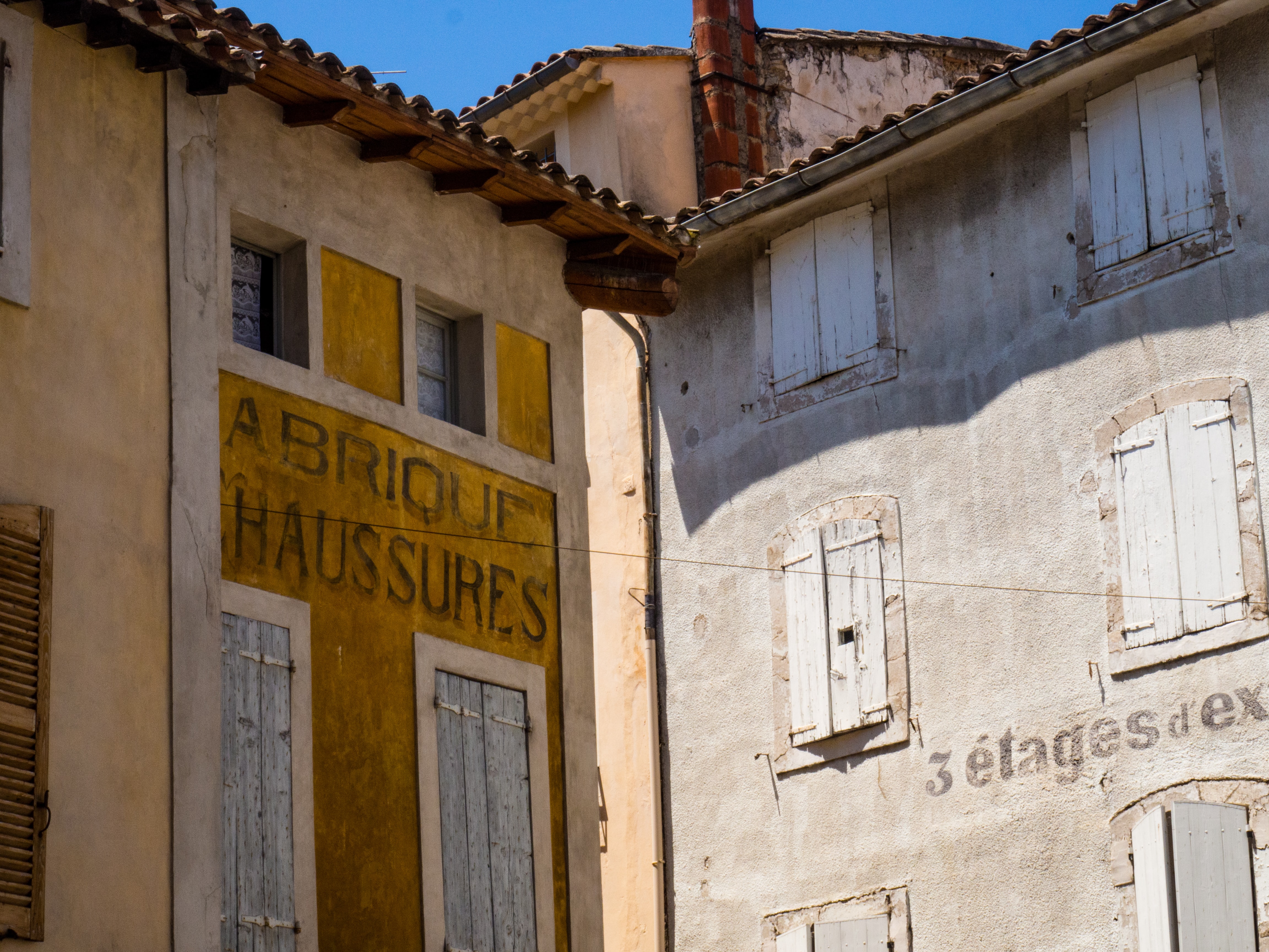
Then came the emergence of Signwriting! Signs were everywhere, on street corners, shops, in factories and on advertising hoardings. Some are elaborate and decorative, others just informative, but for thousands of years, all were hand-painted by signwriters.
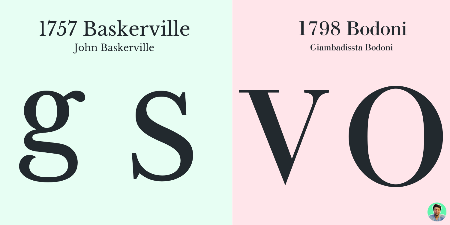
When literacy rose, people started to read and engage with them glorious pub signs in Great Britain, publishers had to standardize typefaces, spacings and certain themes and templates. The most famous typefaces were Baskerville and Bodoni Typefaces, which are still used by designers and publishers to this day.
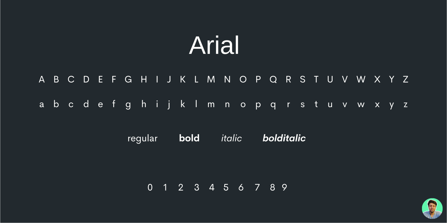
In 70s and 80s, when computers came into picture, publishers found a new way to create their own fonts and make them available to everyone. In 1982, came the most prominent typeface called “Arial”.
Feeling Nostalgia already? Thanks to Microsoft and windows we had a new way to display typefaces and this changed the world. If you’re on a Mac, they have their own set of fonts installed, which include fonts like Helvetica and Calibri.
Types Classification
Most typefaces can classified into 3 different types: the one with serifs, the one without serifs, and decorative styles. If you’d like to read further about these styles, here is a very good resource I found.
But roughly we can classify them in 6 types:
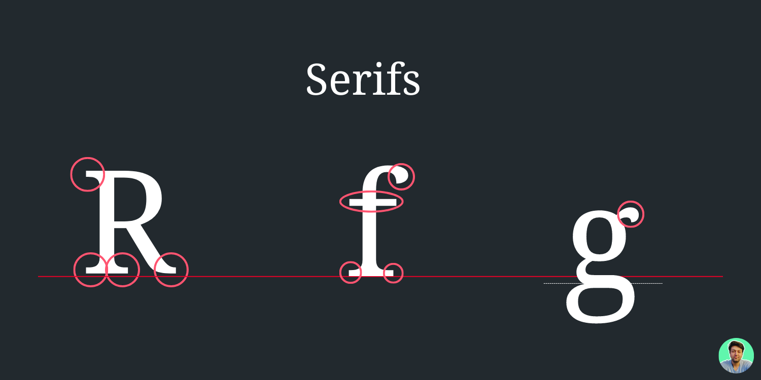
- Serif Fonts:
Serifs were originated from Latin and they used to carved in stone literally. They get called serif because serif is a stroke or line attached to the letters. They are considered original form of fonts and are still widely used.
They are mostly used in books and newspapers. Serif fonts have a greater legibility compared to sans serif fonts because they are easier to read on a low resolution screen. They are a perfect fit for your Headlines and Display texts.
Serif fonts are also used in daily life and you will have encountered them before. Examples of serif fonts are Times New Roman, Georgia, Grammond.
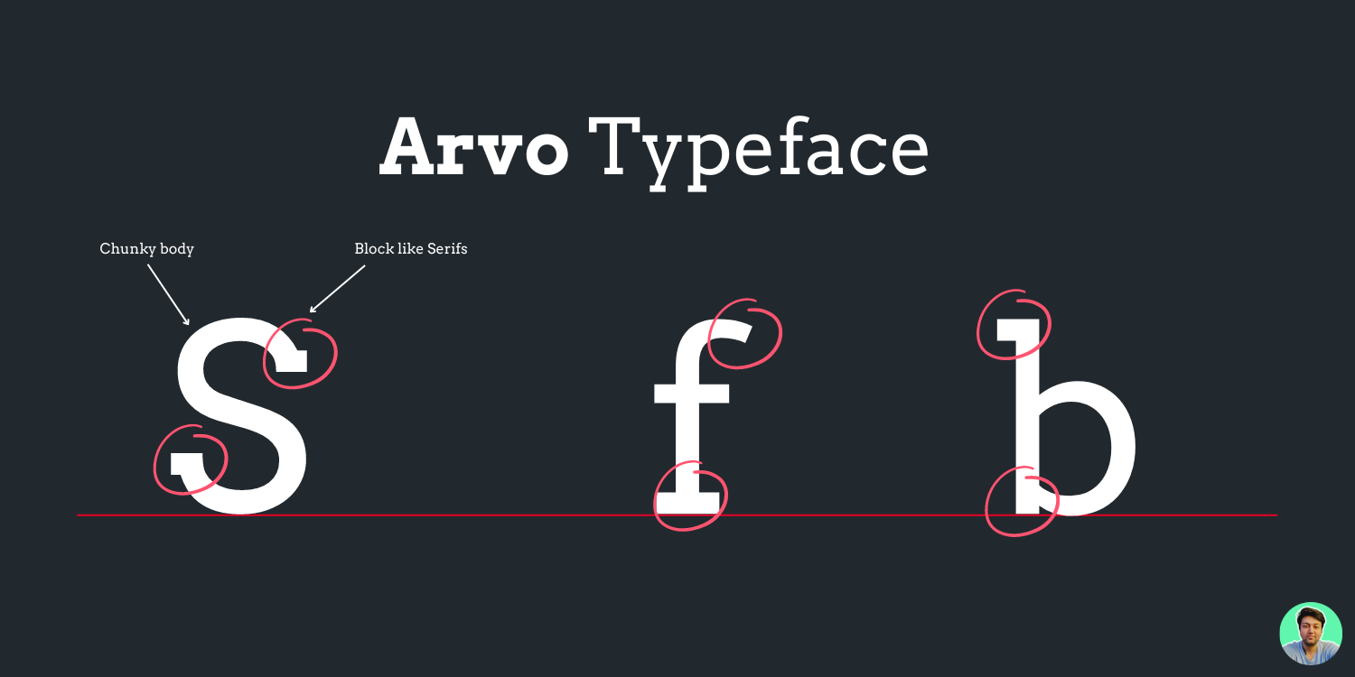
- Slab Serif fonts:
These are the bolder and chunkier versions of the serif fonts. Examples of fonts include rockwell and arvo.
Their block-like serifs catch the viewer’s attention and are used in large media spaces like billboards. They can also be easy to read. Amazon’s Kindle uses slab serif as its default.
- San Serif fonts:
Sans serif fonts are fonts without the serif or the curve at the top and bottom of the letterforms. They are clean, modern looking and professional.
They are easy to read and they look good on the web. Examples of fonts include Helvetica, Arial and Frutiger.
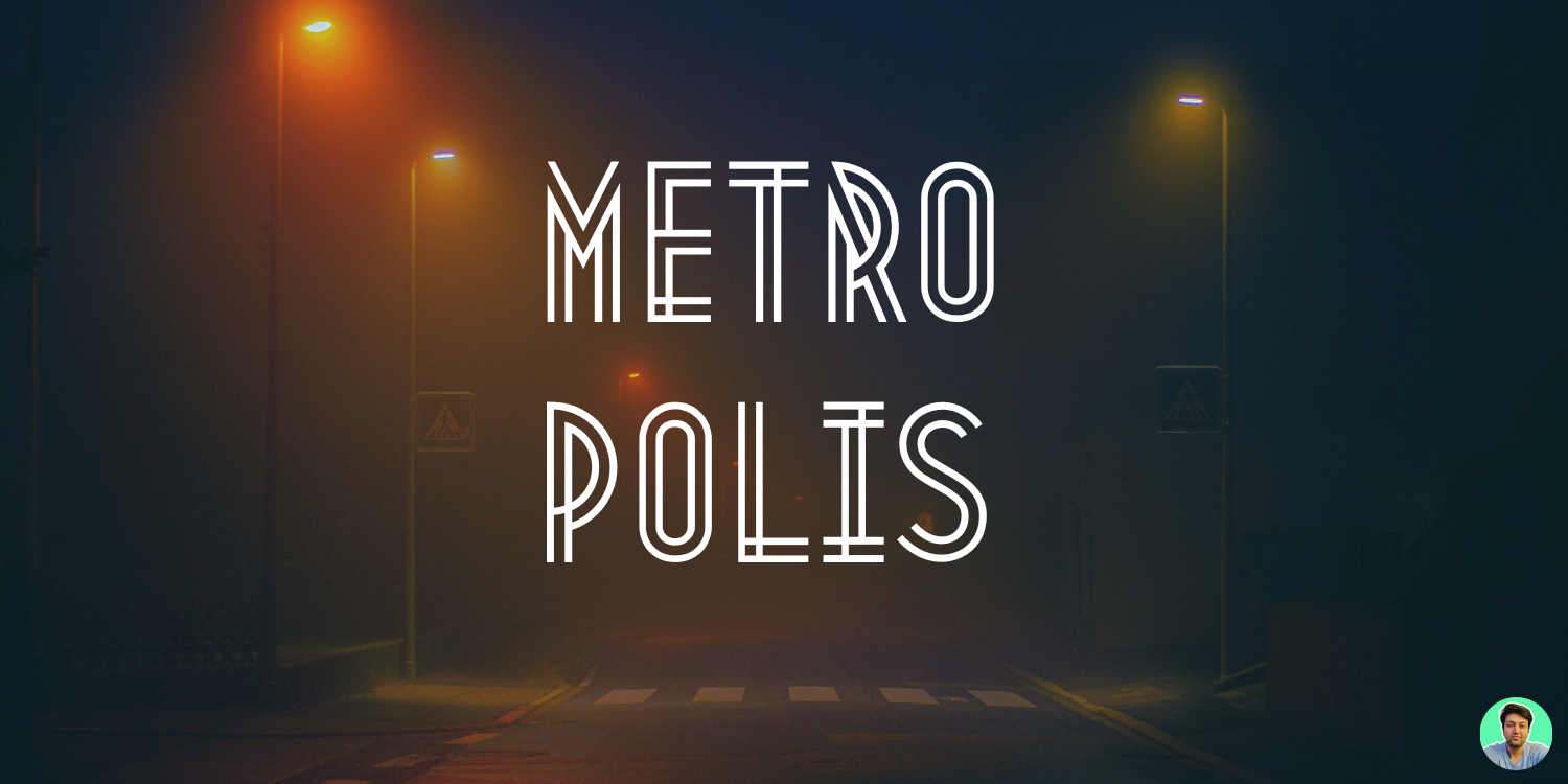
- Decorative Fonts:
Decorative fonts combine various styles and graphics. There is also room for designers to experiment and come up with their own fonts. Examples of fonts include bangers and fredericka.
These fonts are more playful and casual, but they are not ideal for professional use. Although there are some decorative fonts that can be used in magazines, logos and other designs. A good examples are the fonts Metropolis, and Bangers & Mesh which was used on the cover of a design magazine called Design Week.
- Handwritten Fonts:
Well, who does not like all those hand written notes from Hospitality staff when you visit your fave place to stay, right? This is exactly where Handwritten fonts are inspired from. Handwritten fonts are different to script fonts in that they use a more natural style of writing. There are a range of handwriting styles, so this font can be very broad. Examples of handwritten fonts are sacramento and just another hand.
They are associated with being artistic, playful and casual. They are popular with independent labels and shops like coffee shops or breweries.
Anatomy of Typography
There is a lot you need to know when choosing a right typeface for your project. And knowing anatomy will give you superpower for real. But there is a lot going on in anatomy, and that is exactly why I need you to use this article as your guide.
Alright, Lets go! 🏋️♂️
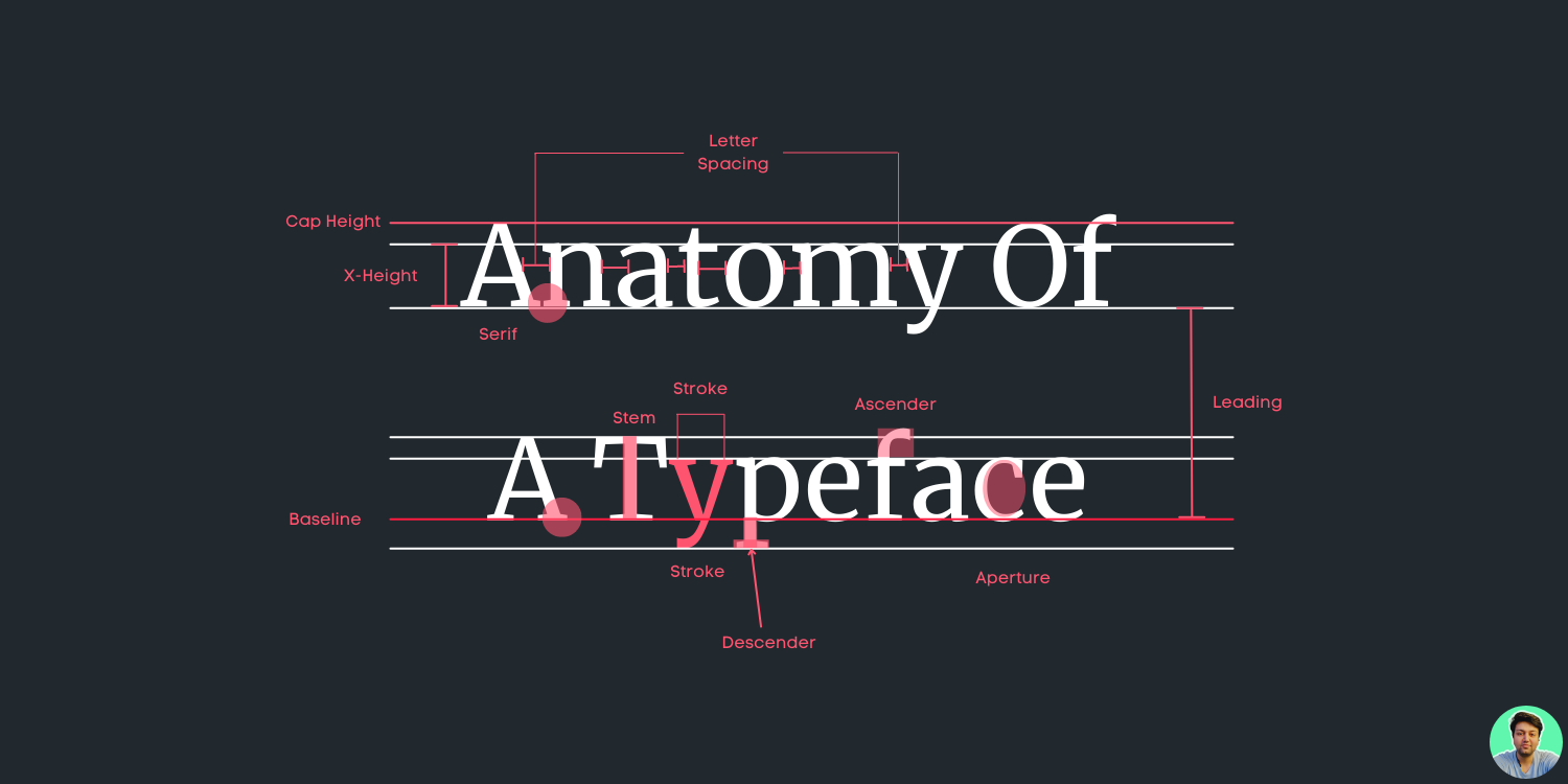
- Baseline:
Majority of the characters sit on this imaginary horizontal line called baseline. Take a look at the example above.
- Cap Height:
The capline or cap height is another imaginary line wherein the heights of all the capital letters are marked in a typeface. However one has to keep in mind that the cap height is below the maximum height of the typeface.
- Crossbar:
The crossbar is a stroke that connects 2 lines in capital letterforms of “A” and “H”. Again a cross stroke implies a horizontal stroke that does not connect two lines, for example, the lower case of “f” or “t”.
- Serif:
Serif is the small stroke that is attached to the end of each stroke in a capital letterform. There are several kinds of serif such as bracketed, wedge-shaped, ball terminal and slab.
But you don’t need to know all of that! Nahh!
- Mean line:
In typography, the mean line, also (and more simply) known as midline, is the line that determines where non-ascending lowercase letters terminate in a typeface. The distance between the baseline and the mean line is called the x-height.
- Bowl:
It is nothing but the rounded curve that covers the negative space in a letter form. Consider, for example, it can be easily viewed in the following letters “I”, “e”, “D”, “o”and “g”.
- Descender:
Descender happens to be the bottom part of the lowercase letter (like “g”, “j”, “p”, “q”, “y” etc) that usually goes below the baseline of a typeface. If used within the body of the text they really look good and beautiful.
- Counter:
Counter refers to the negative space within a letter, particularly if you consider letters like “A”, “o” and “P” etc where the counter is fully enclosed. In letters like “G”, “u” and“c” the non enclosed negative space is reflected and they are also called counters.
- Stem:
The main vertical or diagonal stroke depicted in a letterform is known as Stem. They consists of the vertical parts of the letters like “I” and “H” and also simultaneously all the strokes in the letter “W”.
- Title:
The title is defined as the dot above the lowercase “j” and “I”. Easy peasy!
- Terminal:
The terminal is the culmination point of the stroke or stem that has no serif.
- Ascender:
It is an extension that goes above the meanline and is generally found in some lowercase letters. These letters are, “b”, “d”, “f”, “h”, “k”, “l” and “t”.
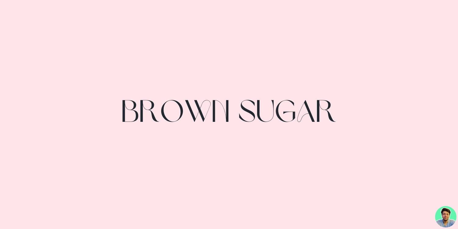
- Ligatures:
You must have seen these in VS Code with certain fonts. It happens when you add two characters to create another character. They are commonly seen in serif faces .It is present to give space between certain characters and give the characters an aesthetic imprint. Brown Sugar Typeface is a good example of a typeface with ligatures.
Rules of Typography
If you combine the following rules for typography, you will see a beautiful and well-designed piece of work. You can use these rules to create a typographic masterpiece.
- Hierarchy:
Hierarchy is the order of importance. You must have seen it in websites and apps. For example, the heading of a document is more important than other text. Typefaces can create hierarchy by using weight and size.
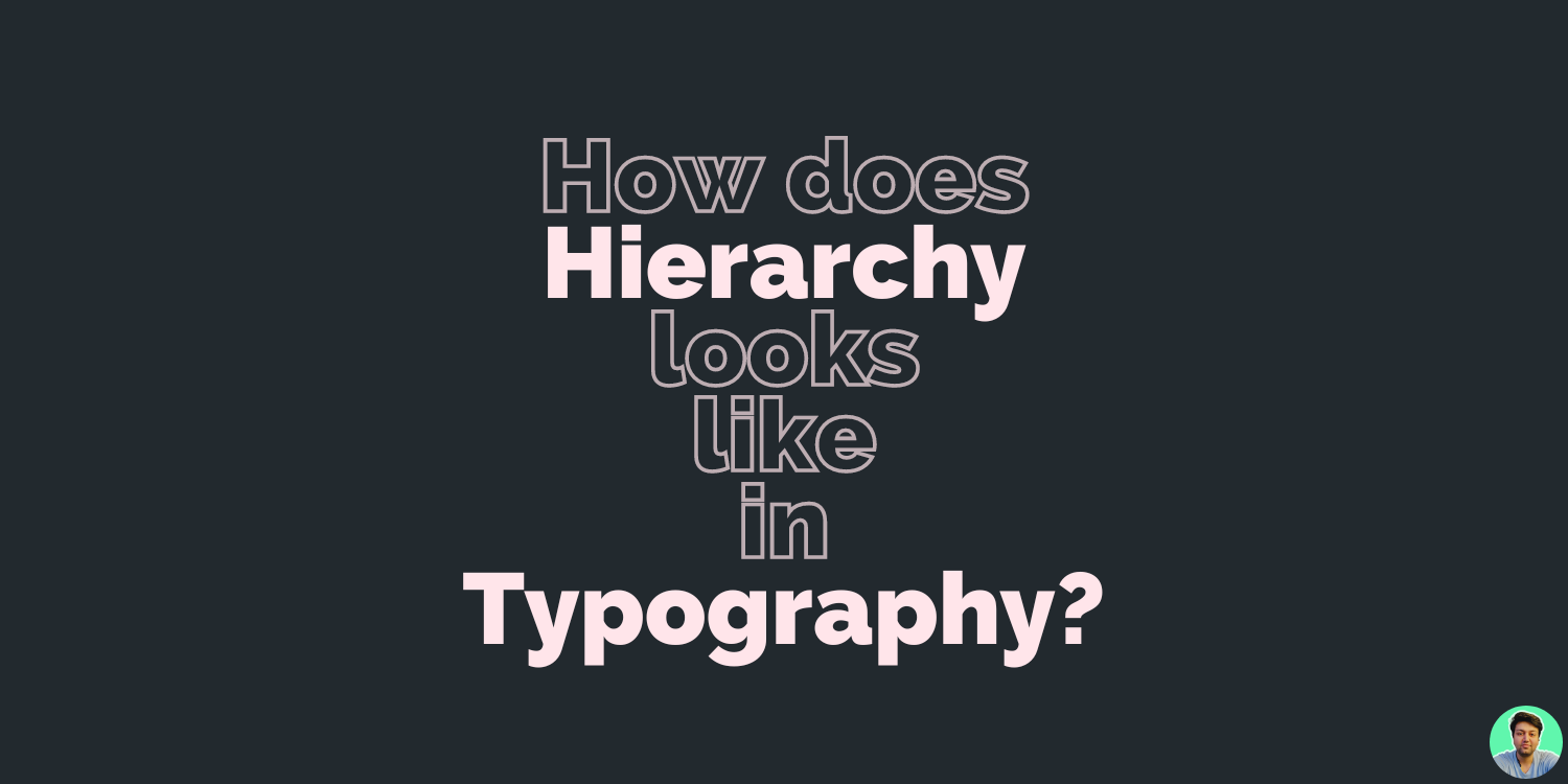
Its Design 101! Its help the reader to identify the context of the text. It also provides the ability to consume the large amount of information. and so much more.
I have attached a video from my fave Graphic Designer Youtuber to understand this further.
- Contrast:
Contrast is the difference between two elements on a design. For example, you can use different colors or different sizes to create contrast.
Contrast makes your content more readable and easier to understand. It also helps your reader distinguish between the content easily so that they don’t get confused.
We can present a sense of urgency, warning etc., like your error states, warning, info states etc. It also throws spotlight on crucial details.
- Consistency:
This can make or break your design! Consistency is the key to a successful design. You want to create a consistent experience for your user, so that they can easily navigate through the product without any confusion. Consistency also helps in creating a brand image for your product or service.
Just stick to your guns, use consistent fonts across your products and even your branding.
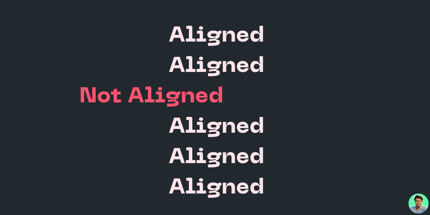
- Alignment:
People often think that alignment refers only to text being placed on the left or right side of a page. That is true at some point, but this term means much more than simply moving a block of text.
Aligning text, graphics, and other elements is a way to create visually appealing interfaces that are easy for people to understand.
When it comes to alignment in Typography, its all about re-enforcing the harmony and good readability.
- Colors:
Color is another important element of Typography. It helps to create a connection between a reader and the content being presented. Choosing the right colors for your product is essential in order to make sure that your message gets across clearly without confusing people with too much information on one page.
Lets be more honest, it is colors that give life to typography. It literally makes it visible. Period! Typefaces can not exist with colors.
By combining the psychology of colors with types, you can convey feel and information to your readers. Like if you visit a website that sells coffee and coffee related products, its predominant color is dark brown.
- Whitespace:
The most underrated and neglected rule of Typography! The most important thing in designing is whitespace. It’s the space between elements, lines and paragraphs that make your page look clean and organized. Whitespace helps to focus the user’s attention on what’s important for them at any given moment.
When it comes to typography design, we need to consider the micro white space. It can be found between lines and paragraphs, characters, grid elements, etc. It has a direct impact on content legibility that influences the user’s reading speed and comprehension.
Its a topic in itself! That’s why I’m attaching this video from my favourite Graphic Designing YouTuber, do check it out!
How a Design System abstracts away the complexities of Typography
Typography is a complex field of study that takes years to learn. There are many rules and guidelines you need to follow when designing with type.
How do we make it easy for everyone? We need a design system that abstracts away these complexities so they can focus on what’s important: their business goals and user needs. Material Design is one such example, it’s a set of guidelines that has been built over the years and has been used throughout Google’s products.
- Type Scale:
The Type Scale is the set of rules that defines the relationship between different weights and styles of a typeface. It’s an important part of any design system because it allows you to quickly choose the right typography for your project.
Material Design ships with its own type scale and the whole type system. You can check this out here.
There are so many different Type Scales that it can be hard to know which one is right for you. That’s why I’ve attached this here for you to play around with different type scales and decide for yourself.
- Typefaces and Pairings:
Material Design comes with Roboto typeface out of the box . Roboto is a great font that works well with other typefaces. You can see the full list of Google Fonts here.
Material Design 3 introduced two new typefaces called Roboto Flex and Roboto Serif. More on that in resources section.
Font pairings can be tricky, but it’s important to note that Google has designed their typefaces with specific pairings in mind. Google recommends using Roboto and Product Sans together for a clean, modern look.
I have a perfect tool that anyone can use for font pairings, check it out here.
- Grids:
Material Design use 4dp grid system for spacing between elements on the page. The grid is based on 4dp system. The baseline for types aligns to 4dp grid. Not just baseline, spacings and line heights are also aligned to 4dp grid system.
This ensures the consistency, accessibility and readability across all devices and screens.
- Language Support and Directions:
Each language use its own characters and glyphs. And its important to respect the uniqueness for languages. If your products is aligned to a specific language or region, its important for typography to align to the same goal.
For example, if you are designing a product for the Spanish market, it’s important to use the right characters and glyphs. It should support proper language directionality, such as left-to-right or right-to-left depending on your chosen audience.
There are languages that are vertically aligned, and the best example of it is Chinese. When designing for these types of languages, it’s important to understand the directionality and flow of the language.
- Cross platform support:
With the increase penetration of smaller devices, it’s important to design your product in such a way that it can be used on any device. It should support both desktop and mobile devices and even wearable devices.
The goal of Material Design is to develop a single underlying system that allows for a unified experience across platforms and device sizes.
- Customizability:
Material Design gives you the flexibility and customisability to extend your branding across other platforms. Diversity of opinion is respected, not forced upon others.
- Design Tokens and Theming:
Google has provided a set of ‘design tokens’ which allow for an easier and more flexible approach to designing UI elements. You can use these design tokens to create your own unique style, or simply follow Google’s guidelines.
- Theming:
Material Design allows you to create themes of your own, and it also comes with a set of default themes for different categories such as light, dark, or vibrant. Adaptability: Material Design is highly adaptable, allowing you to design for any screen size and platform.
Android 12 is perfect example in this instance. The whole system adapts to the wallpaper of your android phone based on default theme.
- Licenses:
Its important to know that the Material Design language is licensed under Apache 2.0, which means that you can use it in your projects and make modifications to it without restrictions.
You can explore and use any typeface in your own from Google Fonts for free. Its as simple as that!
Pro tip: Some typefaces are licensed under Creative Commons, which means that you can use them but not modify or redistribute them. You might want to check out the license before using any typeface in your designs.
Conclusions
Every new idea is just a mashup or a remix of one or more previous ideas — Austin Kleon
Typography is the art and technique of arranging type to make written language legible, readable, and appealing when displayed. It helps you convey your message and it can also be a great way to add personality to your design.
So next time when you choose any typography, ask yourself these questions:
- What personality do you want to instill into your headings, subheadings, and text?
- What tone your message have?
- What audience will see this typeface?
- Does it serve its primary purpose?
- Is typeface web browser friendly?
Also, do check out all the resources attached in next section for anyone who is looking for a great tool to create and use beautiful typography in their next project.
Additional Resources
Disclaimer: The images containing my avatar were created by me and can be used, altered, and distributed freely. Please contact me on my LinkedIn if you’d like to receive copies of them.
This article happens to be a part of a series called “Thinking like a Designer, Inspired By Google’s Material Design”. In the linked article below, I have explained everything about Design Systems and why do need them?! Do check it out!
Hello there! I tried to squeeze as much information about typography as I could into this article. And yes, I left out some details! Do let me know in the comments what you liked about this article or what you didn’t like about it. Or do you want to read similar articles about graphic design or User Experience?
Thank you! And Stay Awesome! ✌️


