


Have you ever visited your friend’s home and complimented them on how beautiful it is? Or Have you seen someone whose fashion sense was particularly good? Or maybe you’ve seen a painting and been so impressed with it that you just had to know who painted it.
If you have, then you’ve experienced how color makes us feel. It’s an amazing tool! The right colours can make a room feel cozy, while the wrong ones can leave your guests feeling cold and distant.
In fact it has extended to Businesses and brands out there.Brands, businesses and companies all over the world are adopting the use of colour to help them define their business.
In fact it’s not even confined to the non-digital world anymore, we’re seeing more and more E-commerce businesses taking advantage of bright bold colours on their very website, products, packaging in order to boost conversions.
In fact, studies have shown that colour is the most important factor in a consumers decision to purchase.
This article will help you understand why colour can be so influential, and how you can use this information to help and boost your presence as a Blogger, Designer, Fashionista, Business Owner or anyone for that matter.
History and The invention of Color Wheel
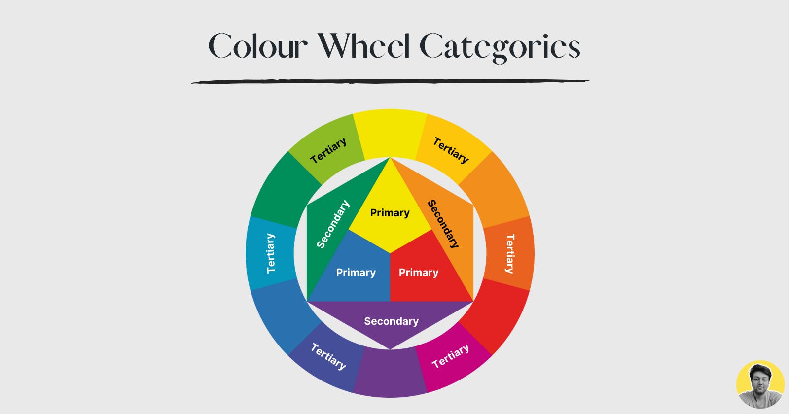
When most people think of colors, they think of the color wheel their teachers showed in their elementary art classes.
Colour wheel is an abstract representation to show the relationships between different colours that can be divided and put into 3 categories called: “Primary”, “Secondary” and “Tertiary”.
The first color wheel was actually presented in 17th century by our one of greatest mind in history: Sir Isaac Newton.
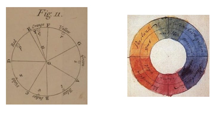
Around that time colors were thought to be a product of mixing of “light” and “dark”, with Red being the “most light” and Blue being the “most dark”.
Newton found this to be flawed and began experiments on white light as he was in isolation with bubonic plague was ravaging the Europe.
In his classic prism experiment, the white light is composed on different colours, on different visible spectrums. Hence, then, mapped the colors in an octave schema called VIBGYOR (Violet, Indigo, Blue, Green, Yellow, Orange, Red).
His further experiments also led to a conclusion that all the secondary colors can be created by mixing of primary colours.
He also concluded that the mixing of colours in VIBGYOR in different “hues” and ratios, resulted in the first hue wheel, which is likely the color wheel we are most used to seeing.
Fast forwarding to 20th century, an American painter named Alfred Munsell added dimensions to the Colour Wheel called: “chrome” and “color value”.
Chroma is the purity or intensity of the color, and is now referred to as saturation. Color value refers to the lightness or darkness of the color, and is now referred to as value or brightness.
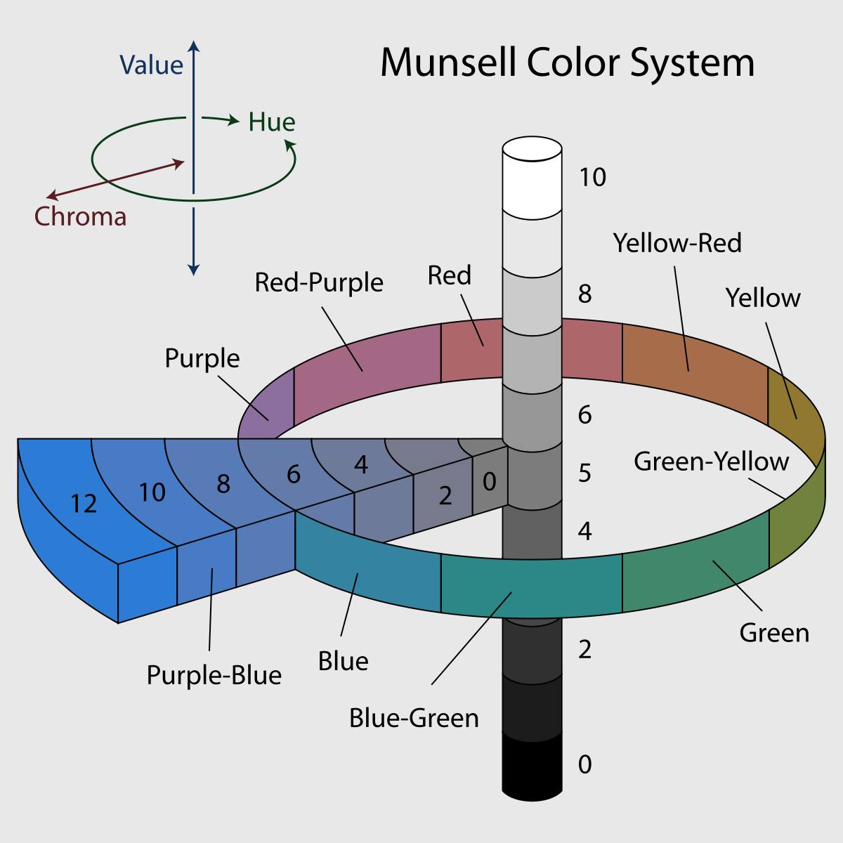
These dimensions now defined the 3D “color space”, represented by Munsell’s tree with color value as the y-axis, chroma as the x-axis, and hue as the z-axis.
Color Formats
The innovations that led to the development of computer screens required different formatting for print media and onscreen formats.
Lets get into it!
CMYK
This is a most widely used color format for printed materials is the CMYK method. CMYK stands for cyan, magenta, yellow and black.
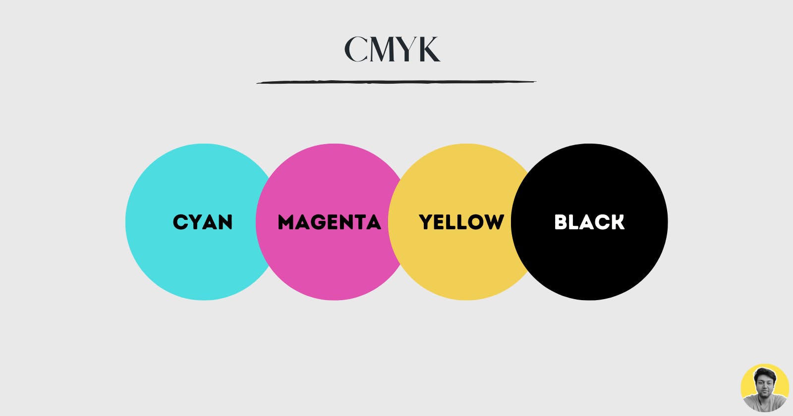
Why should you use a different format? The answer is simple: standardised printing!
This is how it works:
All colors start as blank white, and each layer of ink reduces the initial brightness to create the preferred color. When all colors are mixed together, they create pure black.
This is know as Subtractive Mixing.
The typical use cases for CMYK would be Branding (Business cards, stationeries, etc.), Advertising (Billboards, Posters, Flyers, Brochures etc), Merchandise (t-shirts, hats, swags etc) and Essential Materials (Product Packaging, Menus).
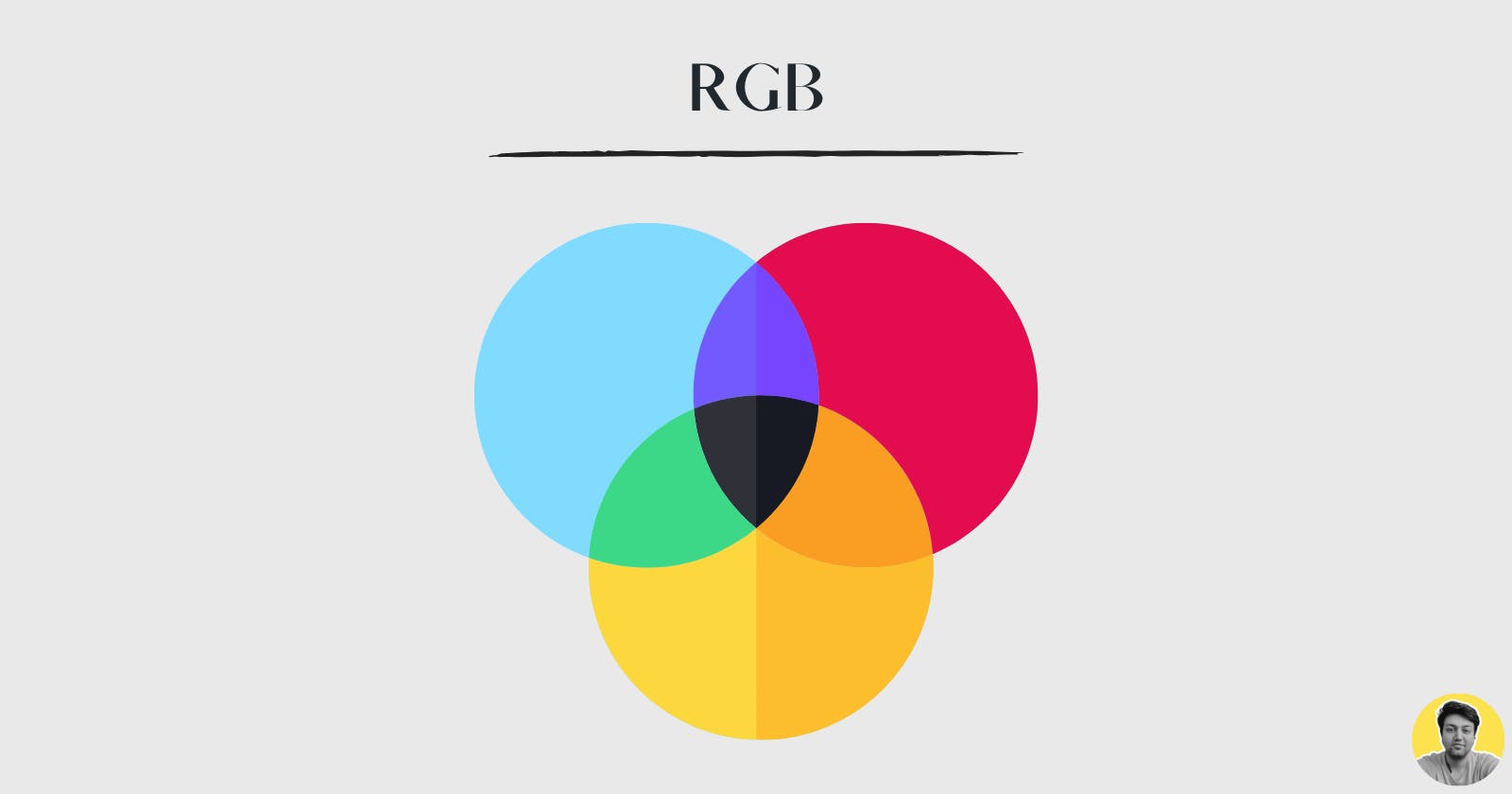
RGB
RGB is the most widely used onscreen color format. It stands for Red, Green and Blue.
Here is how it works:
A light source within a device creates any color you need by mixing red, green and blue and varying their intensity.
This is known as additive mixing: all colors begin as black darkness and then red, green and blue light is added on top of each other to brighten it and create the perfect pigment.
When red, green and blue light is mixed together at equal intensity, they create pure white. You can use this format for pretty much anything related to digital designing.
Hexadecimal
A hex color code is a 6-symbol code made of up to three 2-symbol elements. It has three elements called Red value, Green value, Blue value, to represent a color value ranging from 0 to 255.
Hex colors are based on the RGB color model that has been in use since the early days of photography.
The theory behind the model is that you can create virtually any color the eye can see by assigning different combinations of red, green, and blue color values.
HSL
If you find above color formats pretty confusing, then HSL will feel like a breath of fresh air.
It is much more closer to how humans think of colours. It has 3 elements to it:
Hue is the overall color. It ranges from 0 to 360.
Saturation is how vivid or intense a colour is. A low saturation color would appear grey or washed out, while a high saturation color would appear intense and colourful. Ranges from 0% to 100%.
Lightness describes how light or dark a color is. Black has a very low lightness. White has a very high lightness. (The lightness ranges from 0% to 100%.)
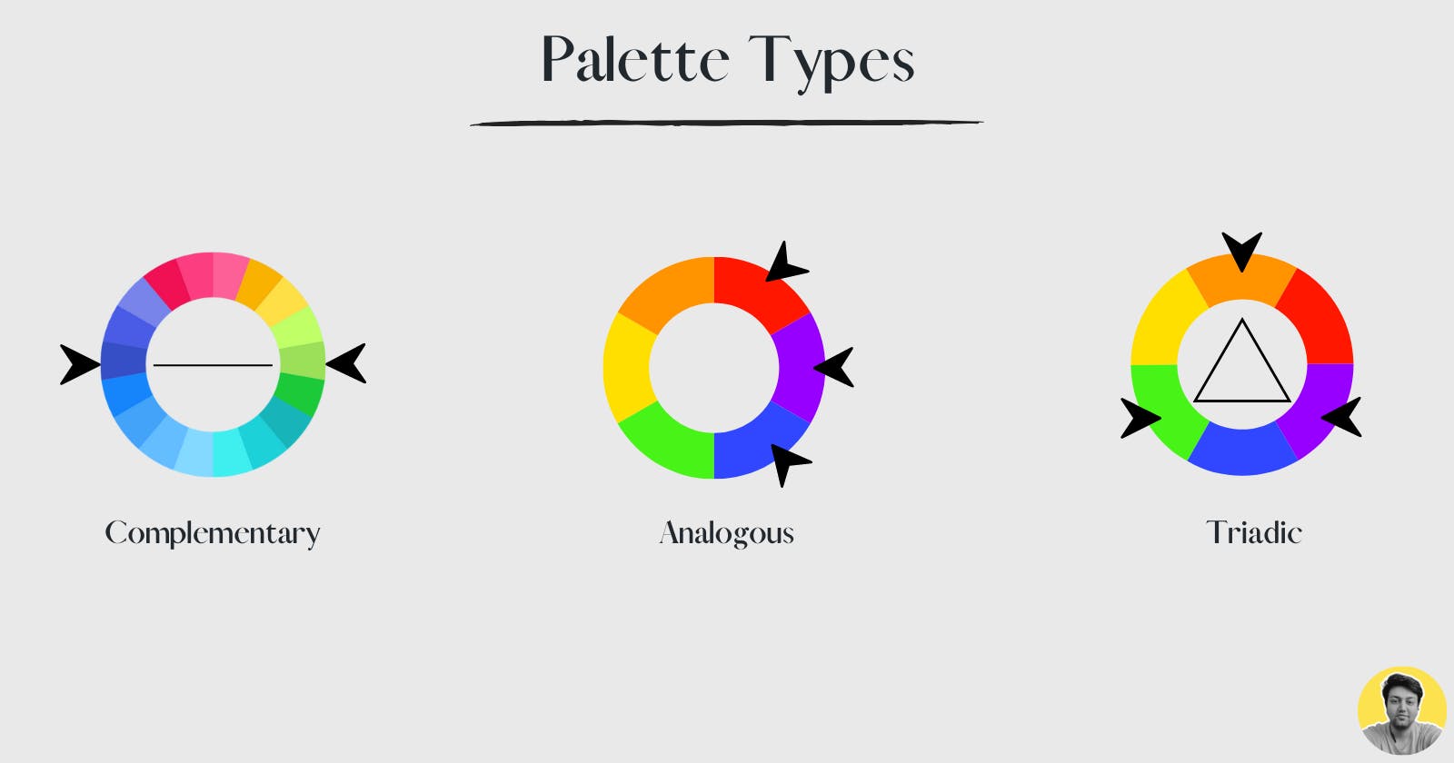
Palette Types
When thinking of a new project, you must think of palette types. There can be 4 (main) different kinds of color palettes:
Monochromatic
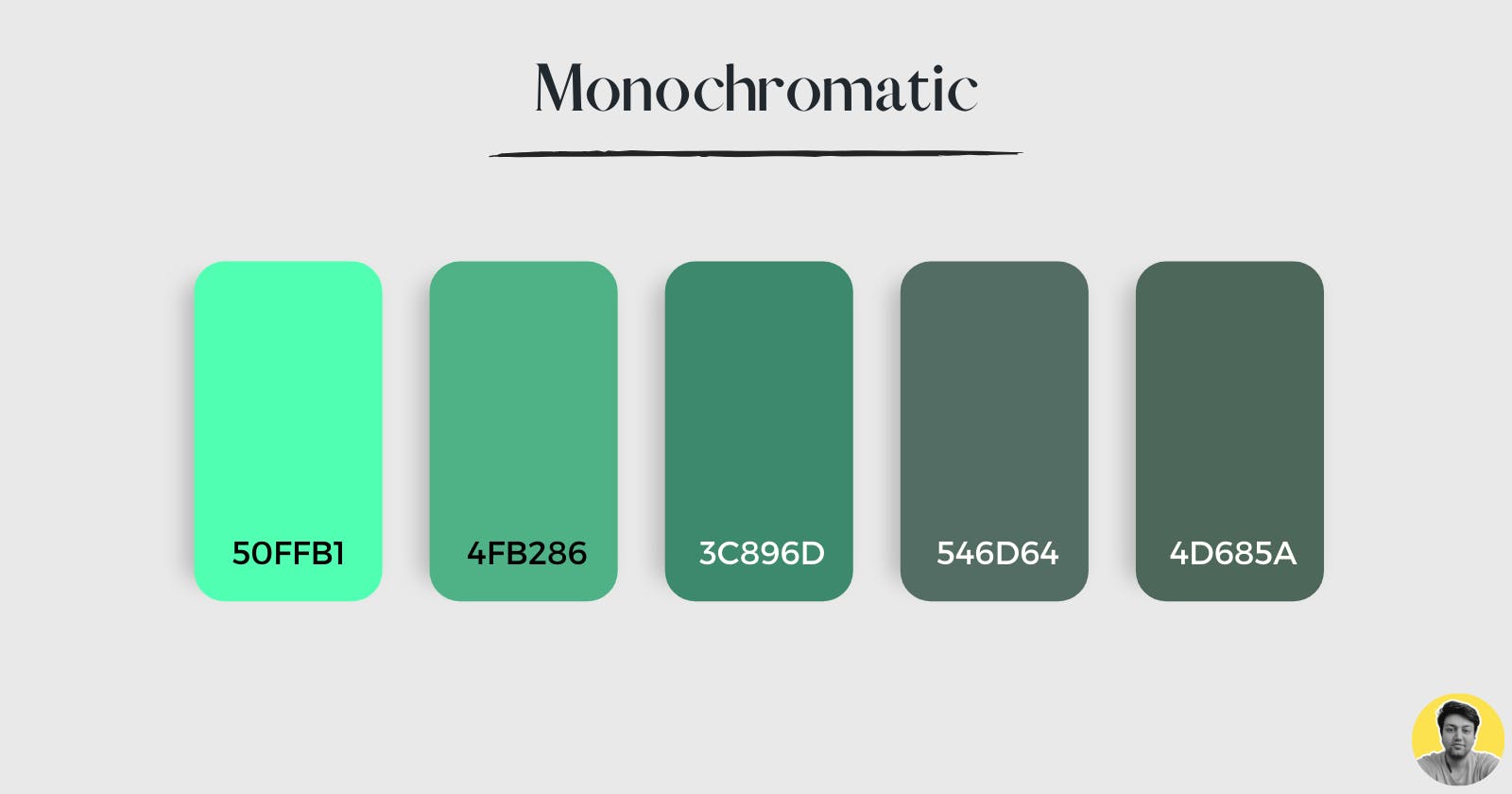
If you like keeping things plain and simple, you should go for the monochromatic color palettes as they consist of the same hue in different shades and tones.
The plus side to creating monochromatic color palettes is that they’re nearly impossible to mess up. Its because you’re playing with the same color, so the chances of disasters are relatively minimal.
However, keep in mind that it can often become way too plain and boring too.
It would be best if you went for this color palette when working with a corporate color that probably doesn’t like to mix up a lot of colors.
Analogous
These are very straightforward and most easy to create.
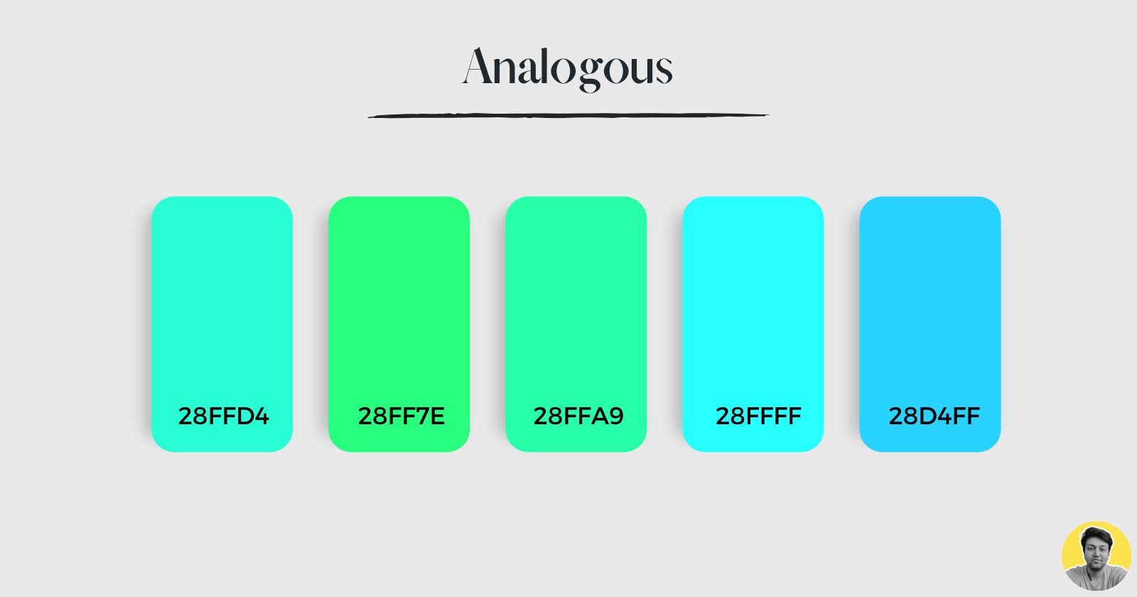
If you have a primary colour and the hues around it from the colour wheel. For instance, if you choose the color blue, just look for the other colours around it.
These are great for creating a cohesive visual that doesn’t look too busy and can make your designs look more professional.
Complementary
These are very contrasting and are good for creating visual interest.
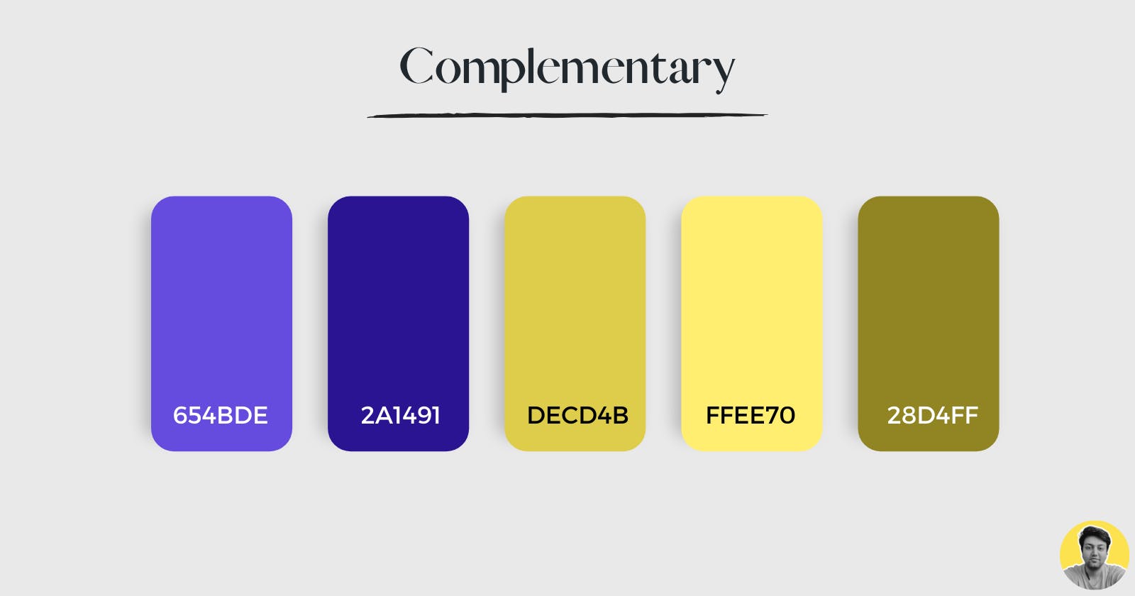
If you have two colours that are opposite on the colour wheel, then choose one as your primary colour and the other as your secondary colour.
These will create a nice contrast that can make your designs look more visually appealing.
Triadic
These are the most contrasting colours and make your designs look very vibrant.
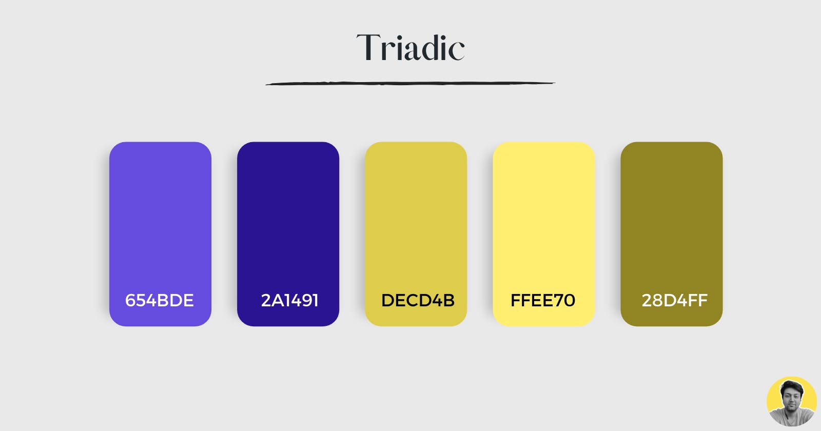
If you have three colours that are equidistant from one another on the colour wheel then choose one as your primary colour, one as secondary and the other as accent.
These will create a nice contrast that can make your designs look more visually appealing.
Few Other terminologies you should know
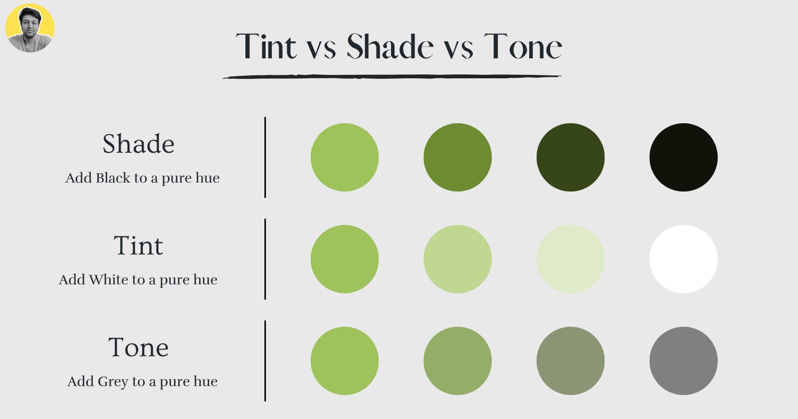
Hue: This is the purest form of a colour. It has no grey or black added to it and is often used when painting or drawing on digital screen. For example, red has a hue of red while pink has more grey in it so would have a lower saturation than red.
Saturation: This is the amount of grey added to a colour. The more grey added, the less saturated that colour becomes. For example, if you have a pure red and add white to it then you will have desaturated (or muted) red.
Chroma: This is the amount of grey added to a colour. The more grey added, the less saturated that colour becomes.
Shade: This is the darker version of a colour. For example, if you want to shade blue, you can use white paint with it to make it lighter and more grey.
Tone: This is the lighter version of a colour. For example, if you want to tone down red, then you can add more white paint with it to make it darker and greener.
Value: This is the lightness and darkness of a colour. You can use black and white paint to change the value of colours.
Nail your Color Palettes
Nailing your colors has more to do with understanding how to use them in a way that makes sense. You shouldn’t just copy your palette from somewhere else and then start working with it.
You should take the time to think about what you’re going for and how you want your product and branding to look before getting started.
Here are some things to keep in mind when creating a color palette:
Hierarchy:
Hierarchy can be described as the order of importance in a system.
It is also the principle that one colour can be more important or dominant than another. This rule states that if you use two colours together, one will be dominant over the other.

For instance, if you use blue and yellow together, the blue will be more dominant than the yellow because it is a cooler colour.
This rule also applies to using different shades of the same colour.
For example, if you want to make a dark green more dominant over a light green, then you can add more black paint with it.
Pro tip: When using two colours in a design, make sure you choose one colour that will be dominant over the other. This will keep your design clean and organized.
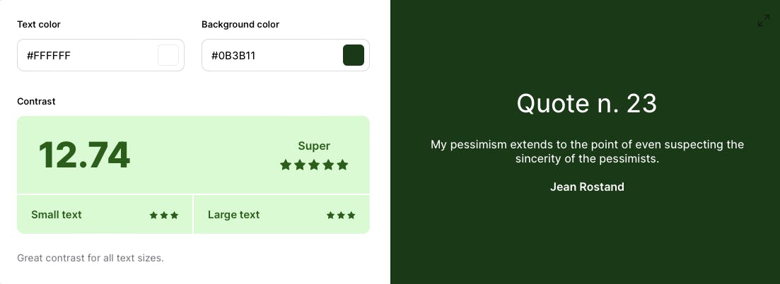
Legibility
This is super important and super powerful when combined with the right Typography.
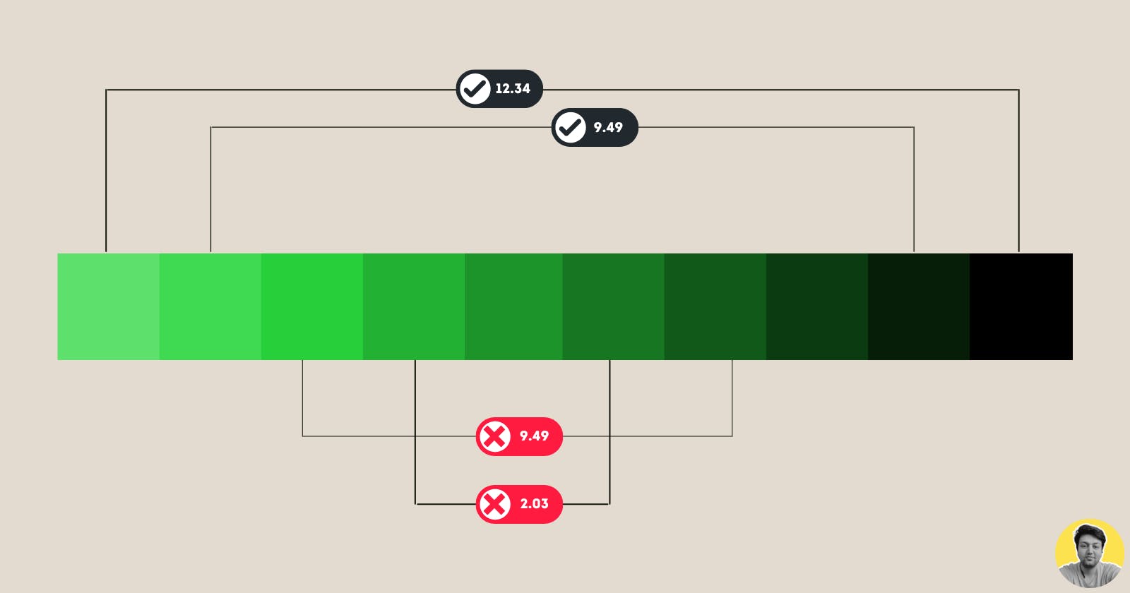
With the right typographyand the right colours, you can make your text stand out and be legible even when it’s not on a white background.
In the above picture, the colour combinations do look pretty but they lack a good contrast ratio.
This means that the colour combinations are not very legible. The text is hard to read and the colours blend into each other.
Pro tip #1: When you can’t find or decide on a color with good contrast, try using either black or white text.
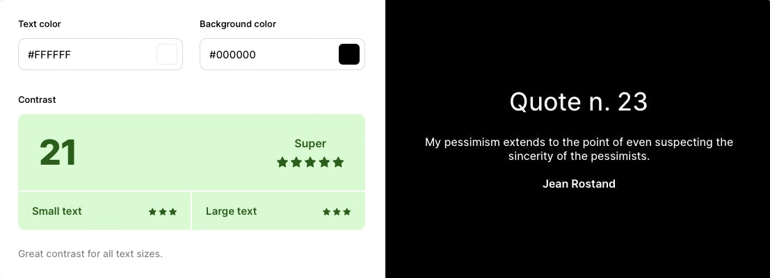
Pro tip #2: For non-text elements such as button containers, must maintain a contrast ratio of 3:1 for standard accessibility.
Expressive
Branding is a vital part of marketing yourself or your business or product.
You color system should be able to effortlessly convey your brand’s identity and personality.
From the logo design, to the colour palette and typography, every element must be cohesive in order to achieve this goal.
Pro tip #1: Always align your colour system to visual identity of your branding.
Pro tip #2: Always align your Typography to your branding as well.
For Instance, Apple have its own Design Language called Apple Human Interface.
These guidelines how they want their products to be designed. It’s important for you to understand your brand’s identity and create a colour system that aligns with it.
Harmonization
When expanding your color palette, it is important to consider how colors will harmonize.
If you want to create a harmonious color palette, it is important to understand what causes harmonies and disharmonies. Harmony is when various elements of design work together in a pleasing way. Disharmony is the opposite.
Pro tip: Experiment with shifting hues a little bit to make your audience feel right at home.
Psychology of colours
Colour can have a psychological impact on how users feel about your product or branding. Certain colours are associated with different emotions, which can affect how your audience reacts to what they see and read.
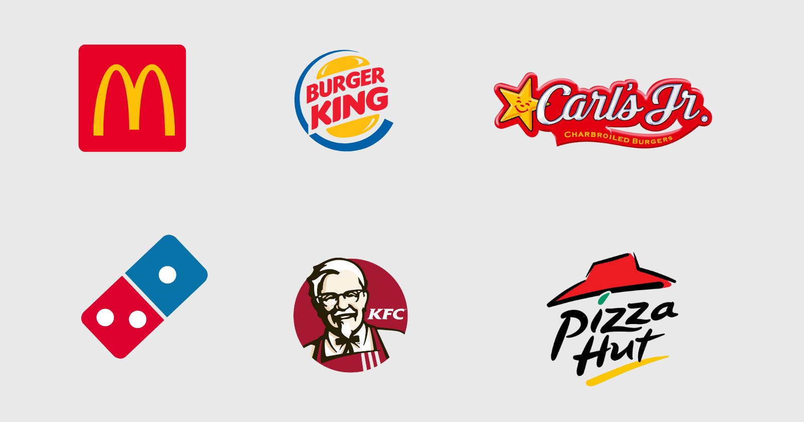
An article reported that many fast-food restaurants use colors such as red, yellow and blue in their storefronts. Why? It increases their appetites and make their customers hungry.
This makes them more likely to enter the store and buy more food while they are at the store.
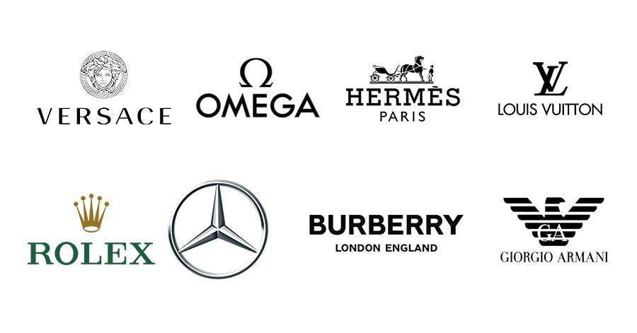
Luxury brands give consumers an experience by using minimalist fonts and metallic colours like gold or silver. It is in the details for luxury brands!
For more information on this, you can check out here.
60–30–10 rule
This is an all-time classic rule for applying colours. Here is how it works:
Choose a palette that reflects your brand or provides the functionality you’re looking for.
Choose a primary color that best represents the brand. It should be large enough to cover at least 60% of your product.
Choose two secondary colors that are complementary to each other. Use these as your supporting colours.
Decide which one is going to be a secondary colour. 30% of your product should consist of secondary colors.
The Remaining 10% would be your accent colour.
This principle is not limited to UI design or graphic design but can be used anywhere matter of fact. You can even apply this rule to your interior decor.
Pro Tip: Use accent colours to highlight important elements like Call To Actions, buttons or links.
Extend your palette
In web or app design, you might find yourself in a situation where your usual color palette is not enough.
Let’s consider a situation where your product needs to showcase data visualisation. You may want to use different colours for every bar, line or illustration.

You should also consider creating different palettes for specific UI elements like error messages, warning boxes etc.
Pro tip: When extending your palette, think about harmonisation. For example, if you are already using red in colour palette, try to experiment with pink or orange as your error states.
Inspirations
If you steal from one author, it’s plagiarism; if you steal from many, it’s research. — Wilson Mizner
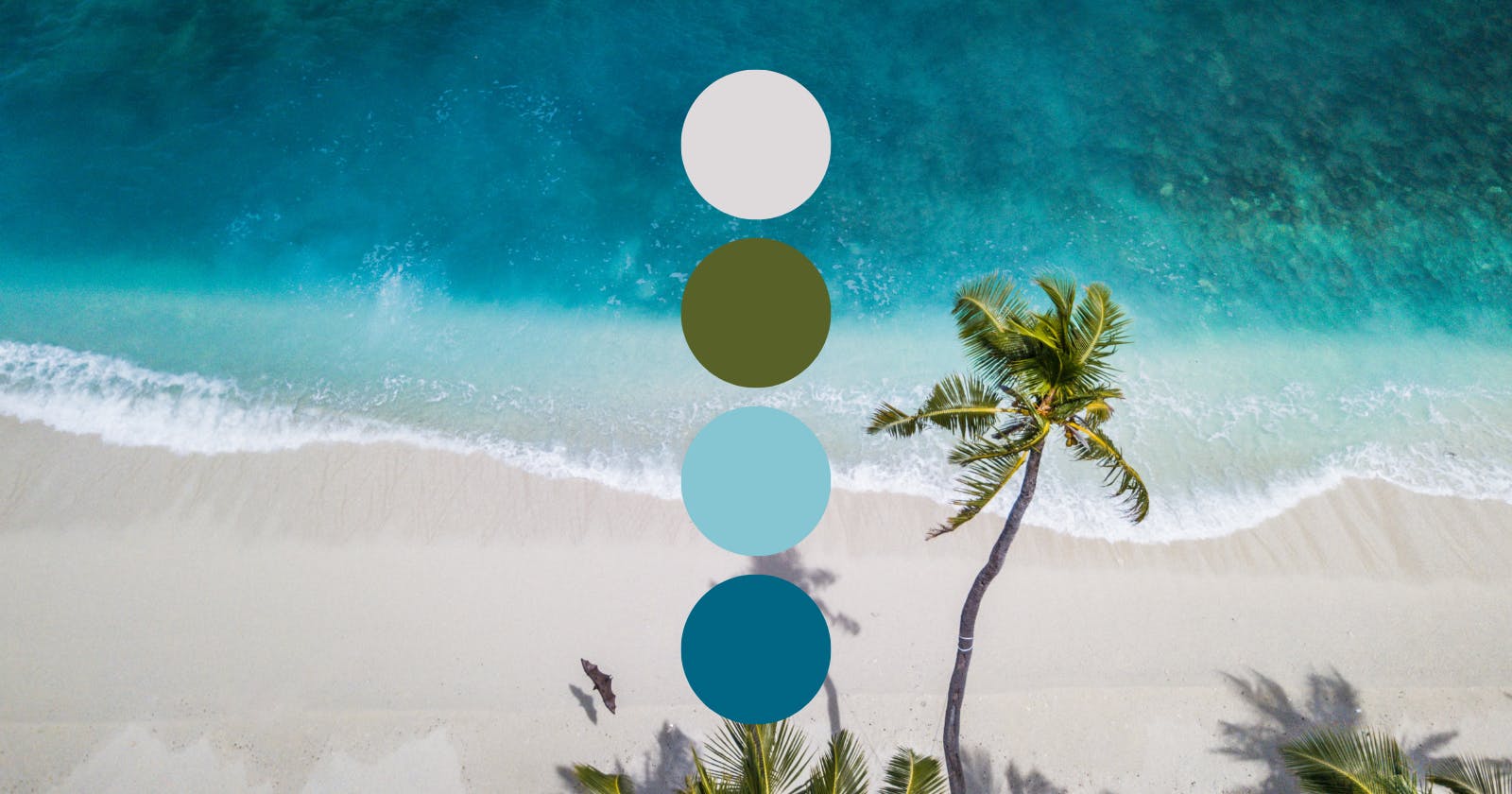
We share one sky, one sun, and one moon, so did our ancestors, great historians or painters or illustrators.
We are all inspired by something, but our first source of inspiration is mother nature.
For example, if you are going for a summery feel, take a vibrant photo of summer and isolate the colors so that they can be applied to your design.
It really is as easy as that!
Pro tip: You can easily achieve this with free AI tools out there. I have linked some below.
Humans are visual learners. We can leverage images to say more with less.
Images tell a story.
Images are a tricky subject, and this section will help you to understand how they can be combined with your designs.
Where are you allowed to use images? Posters, Flyers, Hero Banners, Thumbnails, Product photos, Email Marketing, Thumbnails, Avatars.
There might be instances where you might want to consider using videos instead of images. If you’d like to know more in depth, you can read more about it here.
Here is the checklist to follow when choosing images for your product:
Images/Photos must be relevant to your niche and evoke the right feeling(s).
It is important to follow your brand guidelines. For instance, you should use same branding visualisations throughout your products including images and videos as well.
When choosing a stock image, make sure that it is royalty free or pay the creator for his work if possible.
Make sure you follow the accessibility guidelines. Images are just graphics.
If you can use SVG files instead of PNGs, it is a good idea to do so.
Test your images on all aspect ratios from TV to smart wearables. Make sure you use images with a focal point.
If you are on a tight budget, go for platforms like Unsplash, Pexels, Pixabay to source your images.
Pro tip: Try adding a slight transparency or blur effect to text placed over images so that the words are more legible.
Dark Theme
A dark theme is a great way to set the tone for your digital products.
If you are creating an app that is meant for businesses or users who work in offices, a dark theme can help create a more professional feel.
It also helps reduce eye strain and makes it easier to read in low light conditions.
Dark Themes conserve more energy than lighter themes on AMOLED or OLED panels.
Here are things to remember when creating a dark theme for your product:
Use Grey instead of pure blacks in elevations and space with wider range of depth
If you already have a light theme color palette, that same palette can be desaturated to create darker tones.
Contrast first! It should be your priority over anything else!
Large surfaces use a dark surface color, with limited color accents (light, desaturated and bright, saturated colors)
Apply overlay on surface containers. For instance, for disabled containers, use 12% white overlays.
Do not touch the font weight, just play around with opacity. That’s because of the light seemingly coming from behind and glowing like a halo around the object.
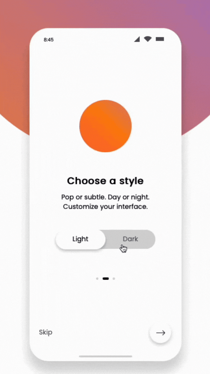
Allow users to switch between both Light and Dark themes.
Conclusion
In a world where everything is so visual, it’s important to use color effectively. The right combination of colors can make your product and branding stand out from the crowd and communicate the brand’s message clearly.
Hopefully, this post has helped to clear up some misconceptions about color theory, and given you a better understanding of why certain palettes work. Remember: when it comes to the best use of color, context is king. Experiment with different palettes for your own designs, and see which approach yields the best results for you.
If you are still here and would like to read more about other components in a Design System, here are a couple of other posts from same series: